SD Tandoor
Restaurant Brand Identity
A warm, appetite-triggering brand identity for an authentic tandoor restaurant in Jaipur — designed to carry the heritage of Rajasthani cuisine while feeling fresh enough to compete in a market full of fast-casual options.
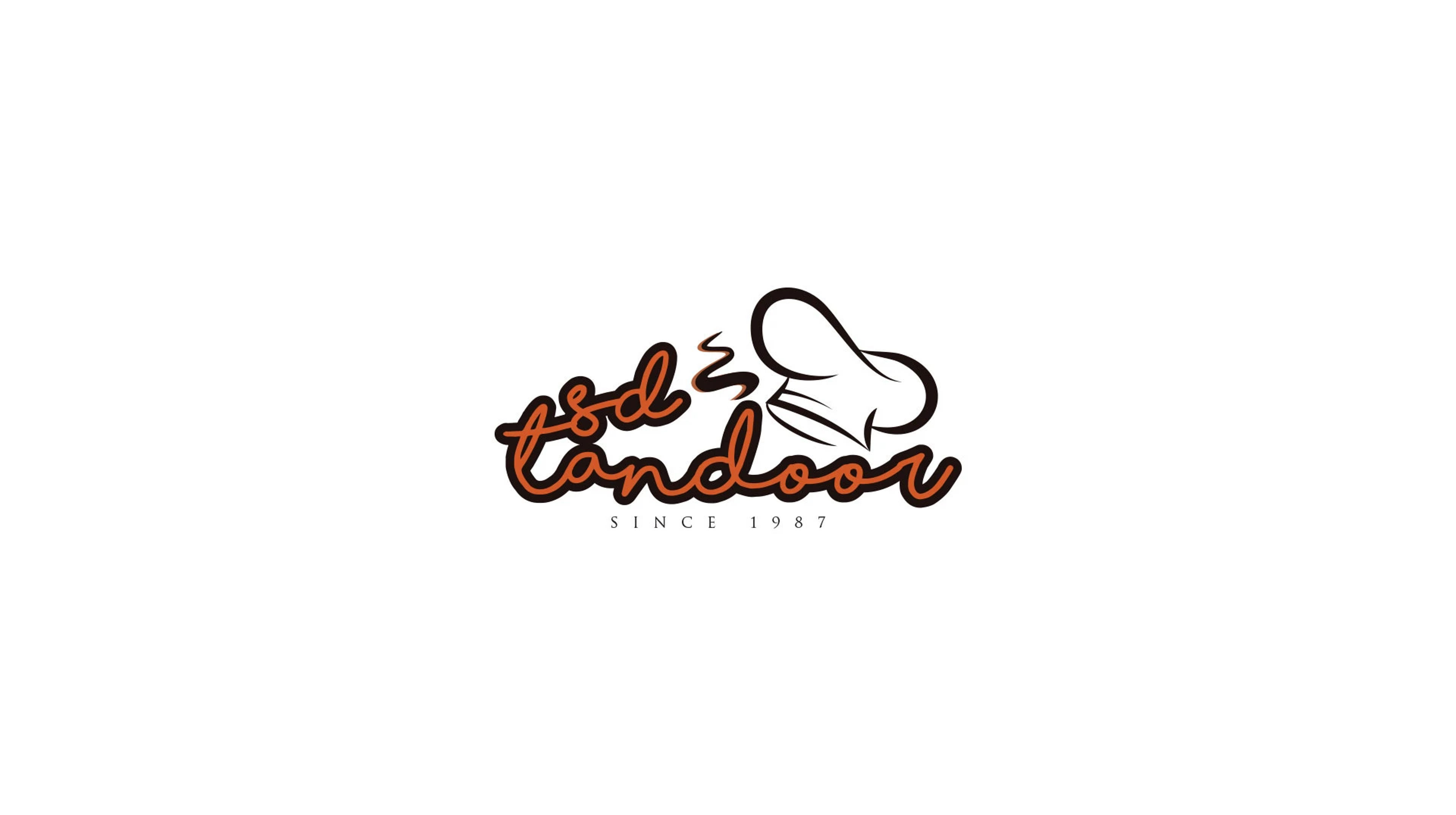
Design a brand identity for a Jaipur tandoor restaurant that communicates the warmth, heritage, and authenticity of Rajasthani cuisine — while feeling fresh enough to attract a younger dining audience.
SD Tandoor serves traditional Rajasthani tandoor cuisine in Jaipur. The restaurant needed a brand identity that honoured the craft of tandoor cooking — slow fire, real charcoal, the kind of roti that doesn't exist in the fast-casual world — while presenting itself in a way that could compete visually on Zomato and Swiggy alongside modern restaurants.
The identity needed to work at every scale: a small outdoor signboard, a takeaway packaging sticker, a Swiggy banner image, and a printed menu. Warmth, appetite-trigger, and authenticity were the three non-negotiable qualities.
A mark that smells like roti and tastes like fire
Symbol
A mark that evokes the warmth and craft of tandoor cooking without resorting to generic food-brand clichés. The identity communicates authenticity at a glance — the kind that makes you trust the kitchen before you've tasted a thing.
Typography
A custom typeface — designed exclusively for SD Tandoor. The letterforms carry warmth without leaning into fussy calligraphy, holding legibility from menu card distance to outdoor signage scale.
Colour
Two colours: Tandoor Ember (#D15727) and Charcoal Base (#000000). The orange carries the heat and appetite of live fire; pure black grounds it with the weight of cast iron and slow coal. The pairing photographs well on food packaging and holds legibility at outdoor signage scale.
Colour, typography & usage
Colour Palette
Tandoor Ember
Fire, Heat, Appetite
Charcoal Base
Craft, Depth, Grounding
Typography
Custom Typeface
Designed exclusively for the brand
Logo Usage

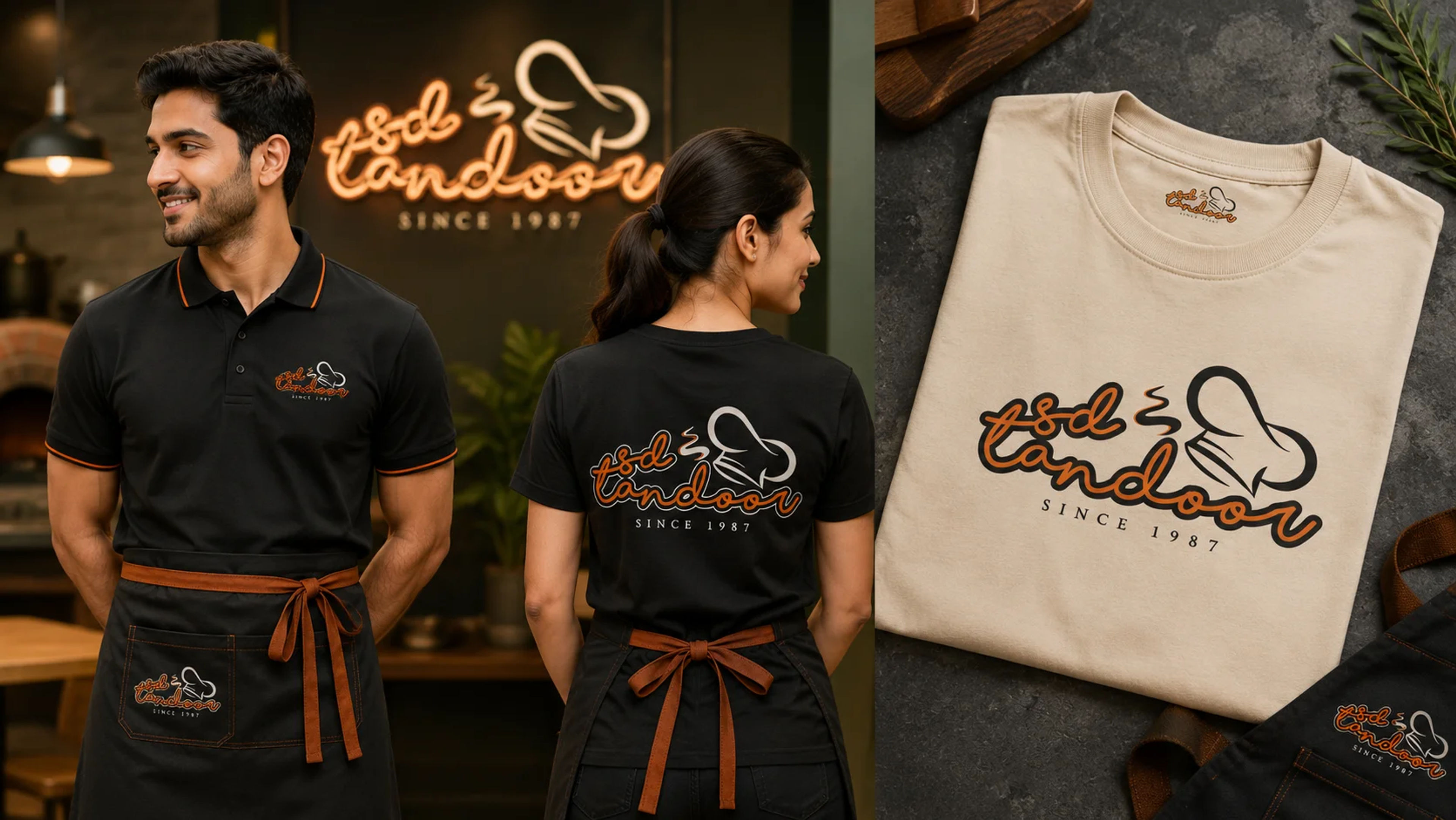
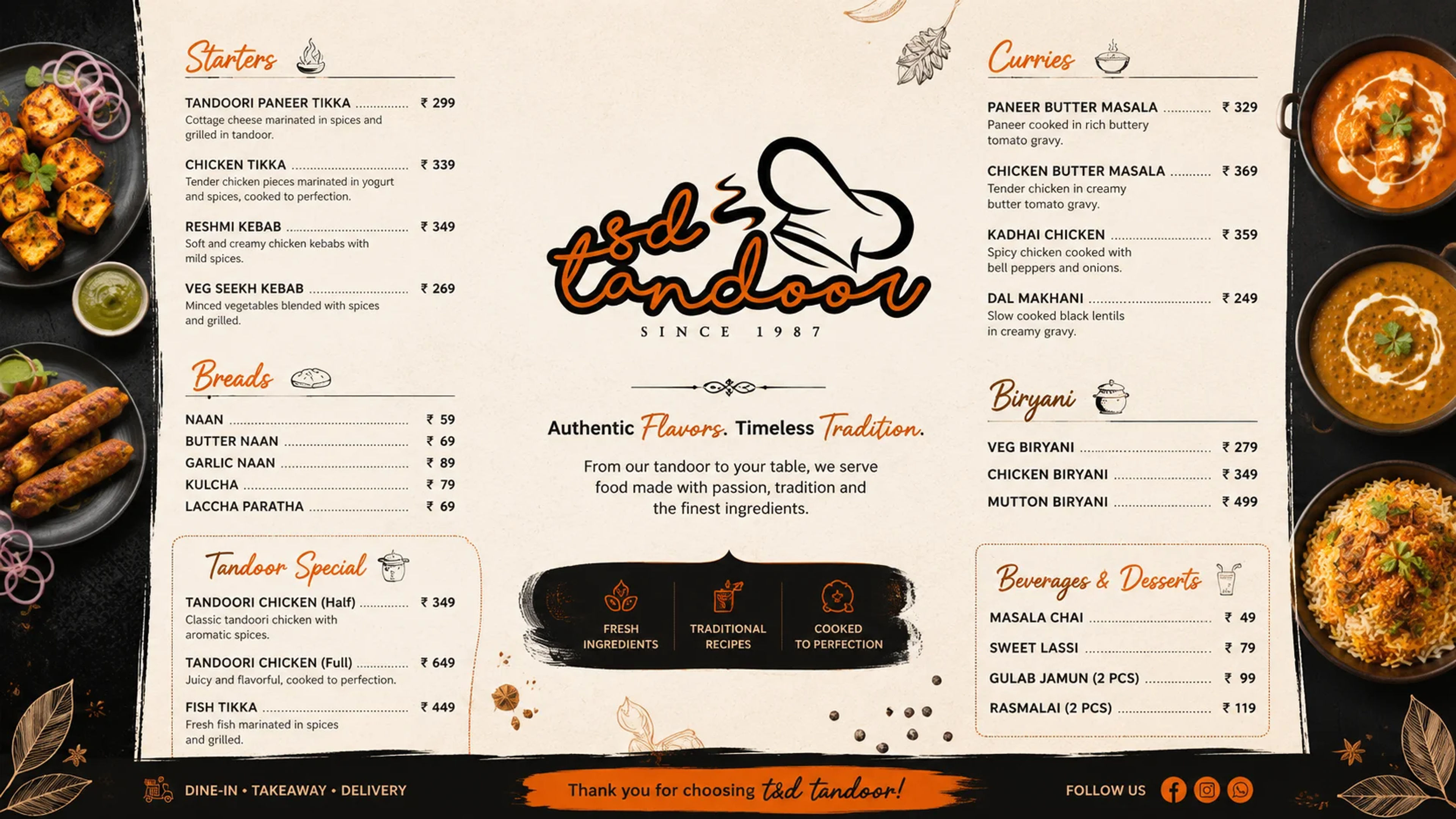
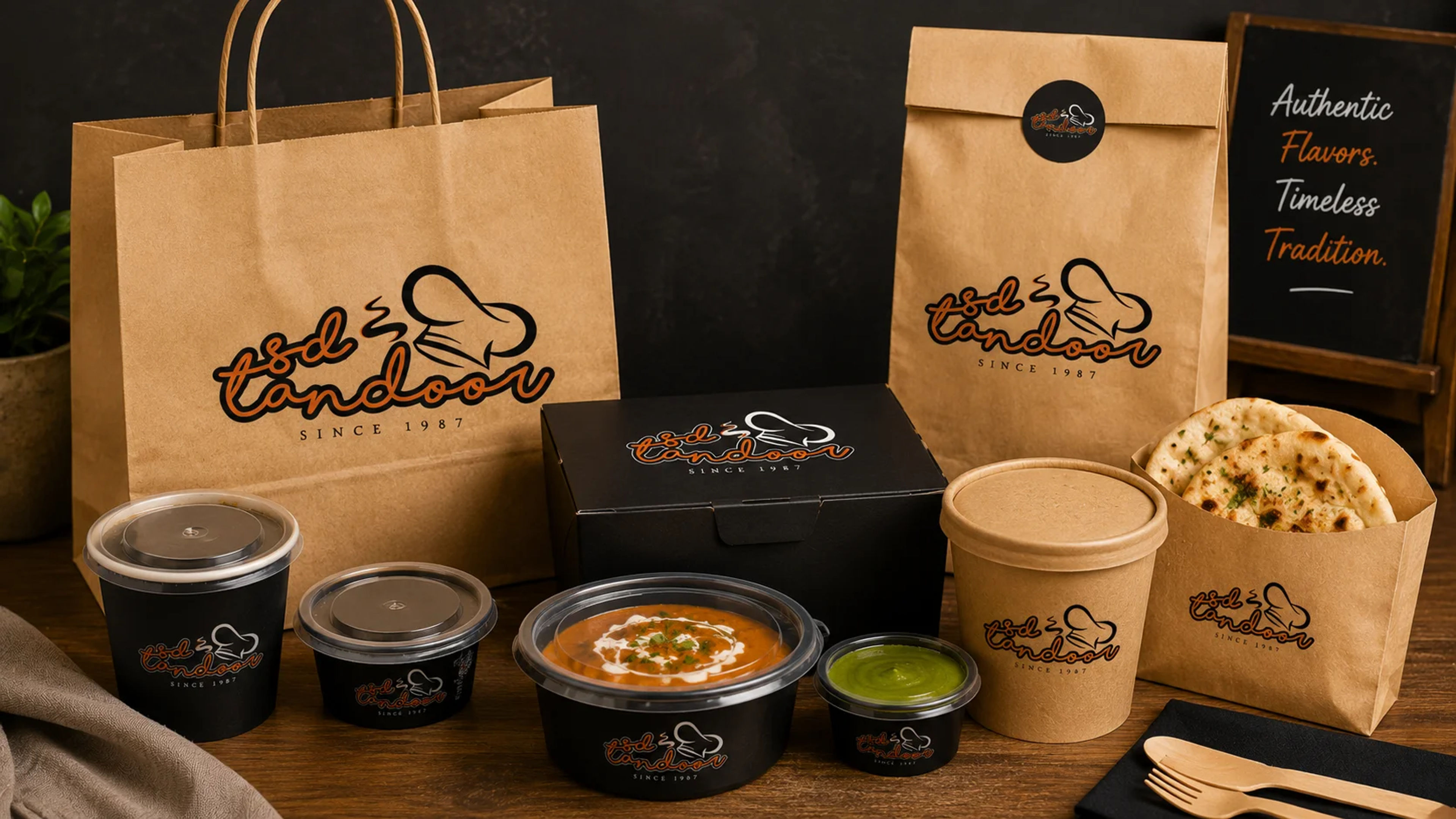
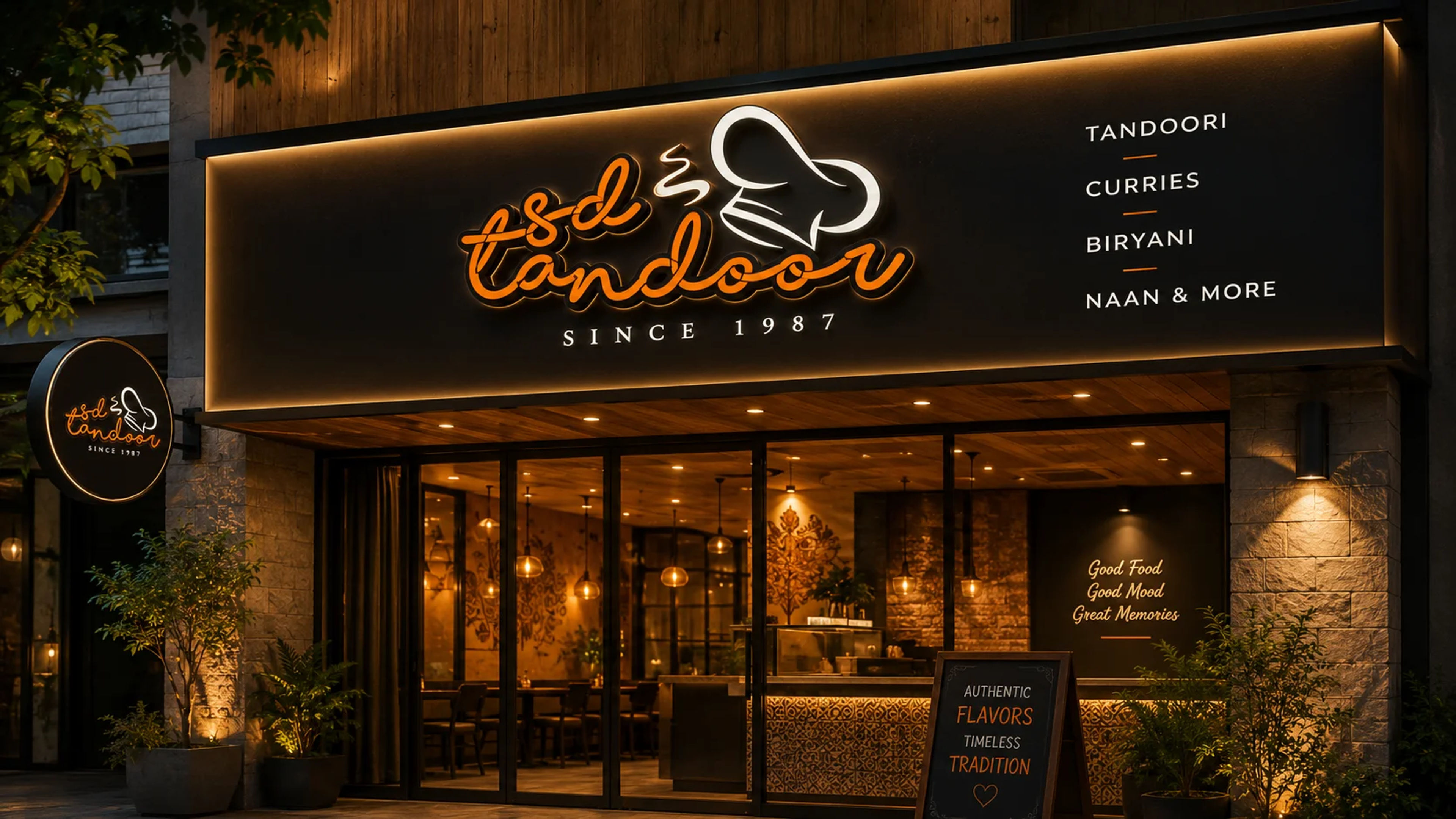
The brand across menu, packaging, and signage
Menu design, takeaway packaging, restaurant signage — all carrying the warmth and authenticity of authentic Rajasthani tandoor.
A restaurant that looks as good as it tastes
The SD Tandoor brand identity was deployed across menus, packaging, signage, and delivery platform profiles. The restaurant now has a visual identity that matches the quality of its food — and competes confidently on digital platforms alongside more modern-looking establishments.
The warm, appetising palette and consistent mark across all touchpoints helped SD Tandoor build immediate visual recognition in its neighbourhood and on food delivery platforms.
More logo & identity projects


Ready to build something
that works?
I help businesses turn ideas into fast, secure and scalable digital solutions.
Currently accepting 2–3 new projects per month.
Trusted by founders & businesses
to deliver real results.
Quick Response
I reply within 24 hours
100% Confidential
Your ideas are safe with me
No Hiring Hassle
No obligation. Just results.