Bungalow Twelve
Heritage Café Brand Identity
A heritage brand identity for a café rooted in Jodhpur's architectural soul — designed to feel timeless from day one.
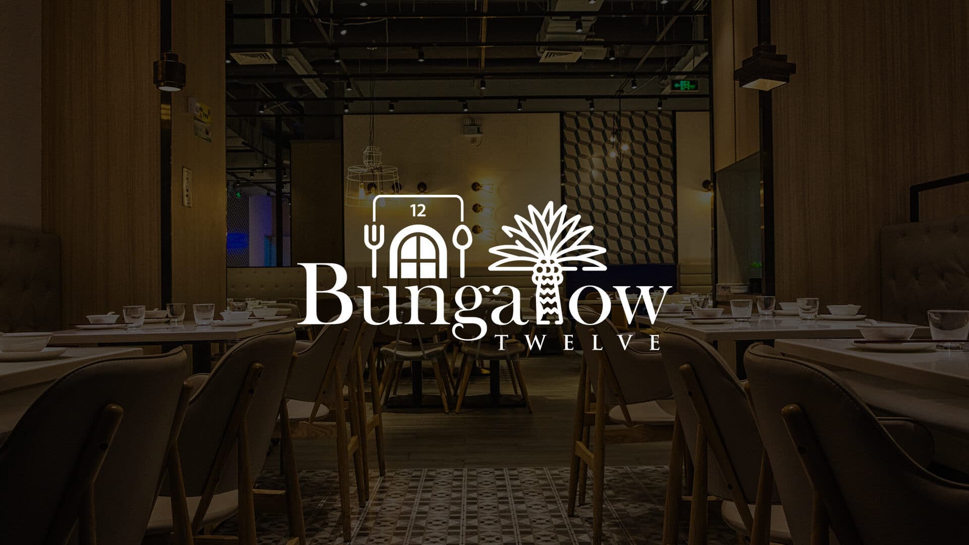
Design a timeless brand identity for a heritage café named after its colonial bungalow address — one that belongs to Jodhpur's architectural legacy without resorting to cliché.
Bungalow Twelve is a café in Jodhpur, Rajasthan — named after the heritage bungalow it calls home. The brief was to create a brand identity that felt timeless: one that would resonate with the city's rich architectural legacy while holding its own across menus, signage, and packaging.
The name alone carried weight. “Bungalow Twelve” evokes a numbered address, a colonial-era property, a place with a story. The design had to deliver that same feeling at every touchpoint.
Restraint as a design principle
Symbol
A timeless wordmark anchored in heritage typography — crafted to feel as though it has always existed. The mark avoids decorative flourish; its weight, spacing, and letterform choice do all the work.
Typography
A classical type hierarchy that pairs a heritage display face with a clean secondary for menus and signage. Every weight and spacing decision was chosen to evoke permanence — carved into a lintel, not designed on a screen.
Colour
A considered palette drawn from Jodhpur's architectural tones — the warmth of sandstone, the depth of the blue city — without leaning on literal reference. Of that place, but not a postcard of it.
Colour, typography & usage
Colour Palette
Jodhpur Sand
Add hex value
Warmth, Heritage, Welcome
Colonial Blue
Add hex value
Depth, Calm, Architectural
Terracotta
Add hex value
Earthen, Grounded, Honest
Cream
Add hex value
Neutral, Clean, Timeless
Typography
Primary Typeface
Add font name
Secondary Typeface
Add font name
Logo Usage
The identity across every touchpoint
Menus, takeaway packaging, in-café signage, and stationery — each carrying the same identity with care.
Mockup to be added
Mockup to be added
Mockup to be added
Mockup to be added
Adopted across every touchpoint from day one
The identity went into use across every customer touchpoint — menus, takeaway packaging, in-café signage, stationery, and digital presence. Nothing was adapted or simplified to fit the format; it held together at every scale.
The client described it as feeling “exactly right for the space.” For a heritage brand, that is the highest possible compliment — not that the logo is impressive, but that it is inevitable.
More logo & identity projects



Ready to build something
that works?
I help businesses turn ideas into fast, secure and scalable digital solutions.
Currently accepting 2–3 new projects per month.
Trusted by founders & businesses
to deliver real results.
Quick Response
I reply within 24 hours
100% Confidential
Your ideas are safe with me
No Hiring Hassle
No obligation. Just results.