USSLS
US Student Loan Services Identity
A student loan services company needed a mark that felt as trustworthy as a bank and as approachable as a counsellor — without borrowing from either. No mortarboards, no dollar signs. Just a clean, credible identity for a financial brand serving a generation of borrowers.
Design a professional, trustworthy logo for a US student loan services company — credible enough for finance, accessible enough for students.
USSLS is a financial services company helping students and graduates navigate the complexities of the US loan system — refinancing, repayment plans, and loan consolidation. The brief called for an identity that communicated reliability and clarity in a sector where trust is everything.
The challenge: financial services branding defaults to corporate blue and shield motifs. The brief pushed beyond those defaults — the company wanted to feel accessible and modern, distinct enough to stand out in a crowded space, while still commanding the credibility required of a brand that handles people's financial futures.
Sketches, concepts, and the directions that didn't make it
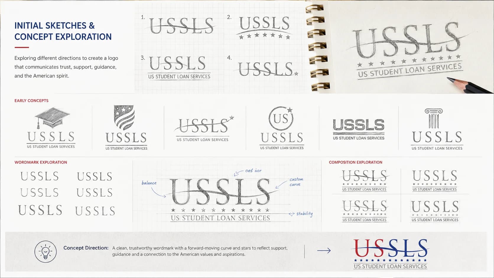
Initial Sketches & Lettermark Studies
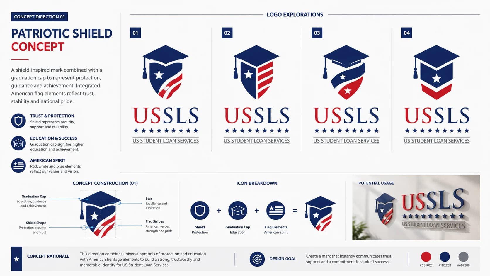
Concept Direction 01 — Geometric Mark
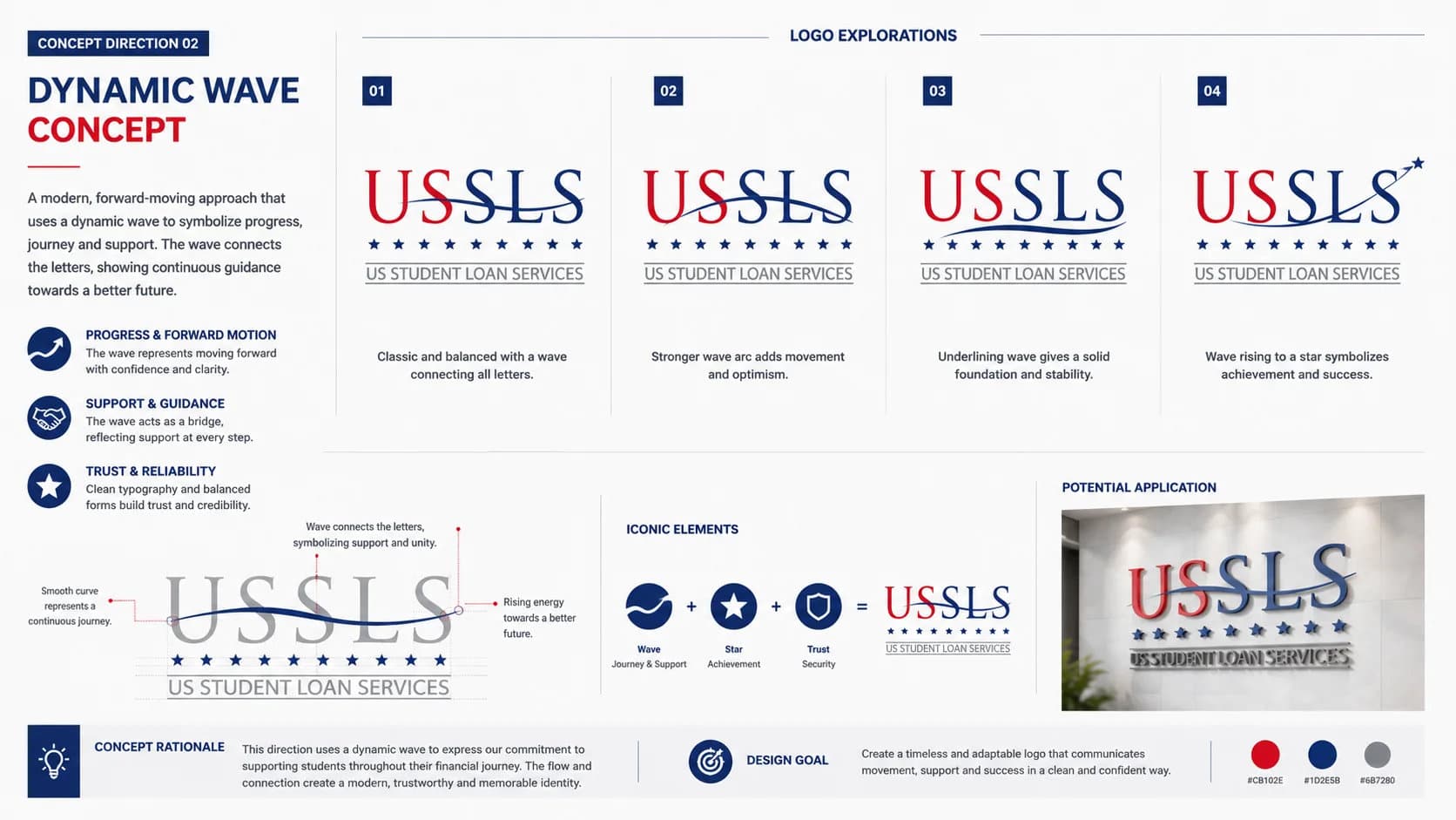
Concept Direction 02 — Abstract Wordmark
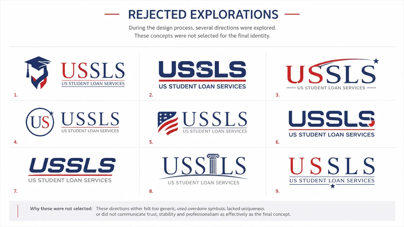
Rejected Explorations
Credible enough to trust. Clear enough to understand at a glance.
Symbol
A clean, professional mark that carries the weight of a financial brand without the rigidity of traditional banking identity. Precise enough for formal documents, open enough for digital applications where trust is established in seconds.
Typography
Add font name — the typeface chosen reinforces the brand's dual commitment to professionalism and accessibility: legible under all conditions, carrying authority without feeling cold or institutional.
Colour
#BE1E2D · #2B3990 · #808285 — a bold red for energy and urgency, deep navy for authority and trust, and warm grey as a professional neutral. Together they balance approachability with the credibility a financial services brand demands.
Colour, typography & usage
Colour Palette
Crimson Red
#BE1E2D
Energy & urgency
Deep Navy
#2B3990
Authority & trust
Warm Grey
#808285
Professional neutral
Typography
Primary Typeface
Add font name
Logo Usage
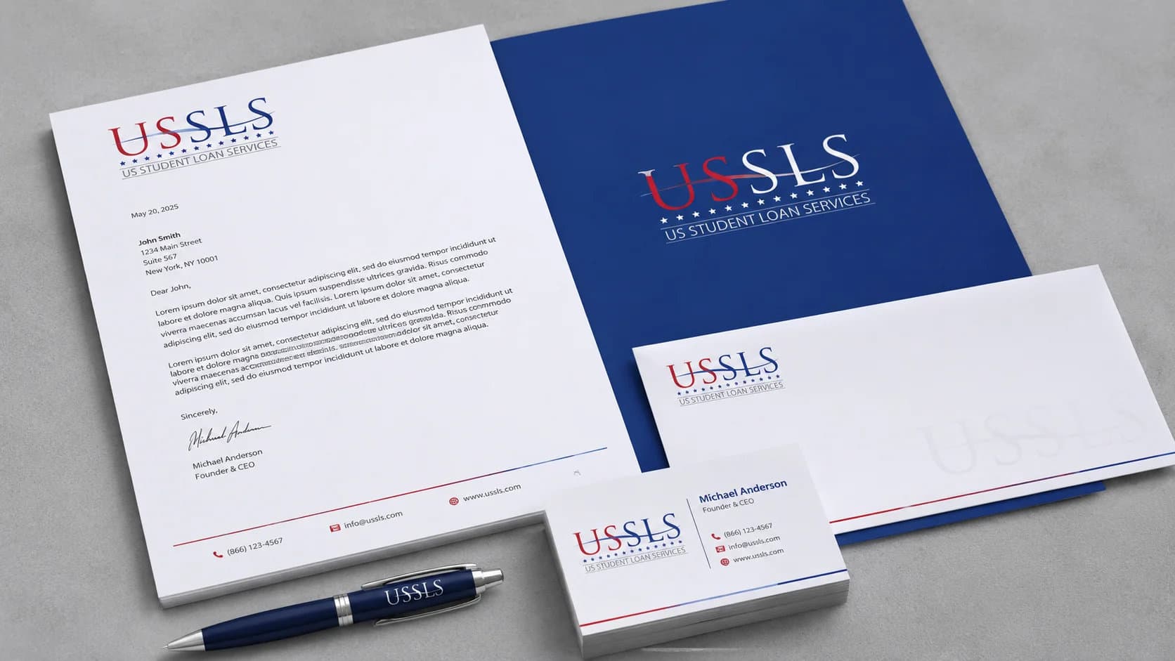
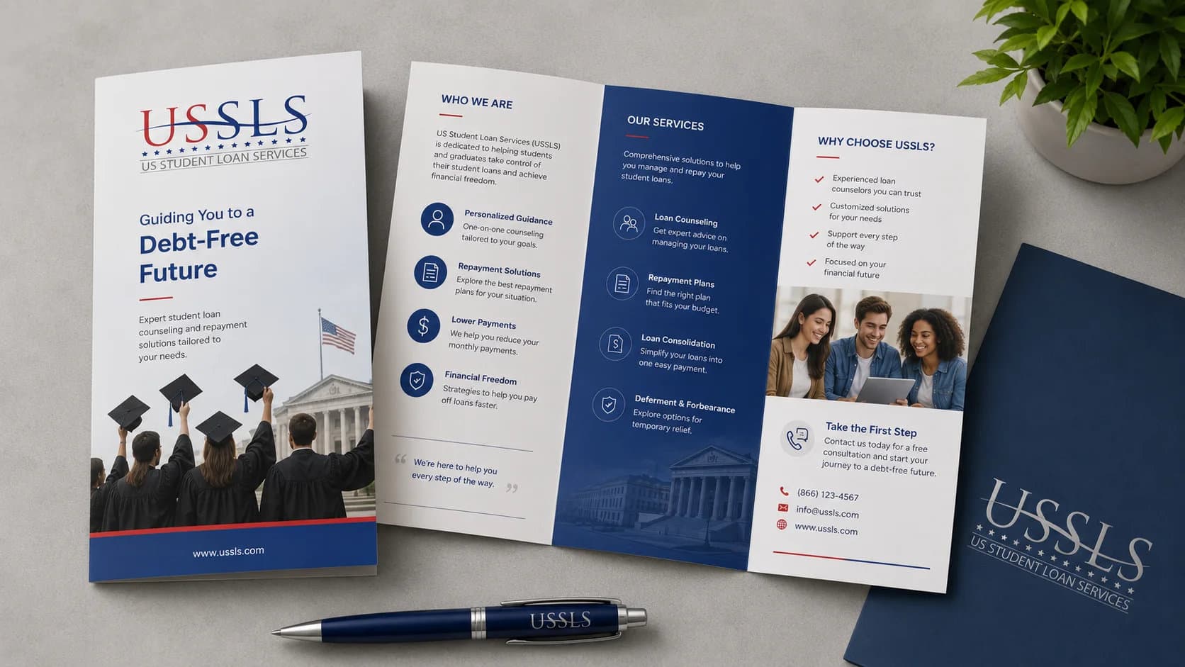
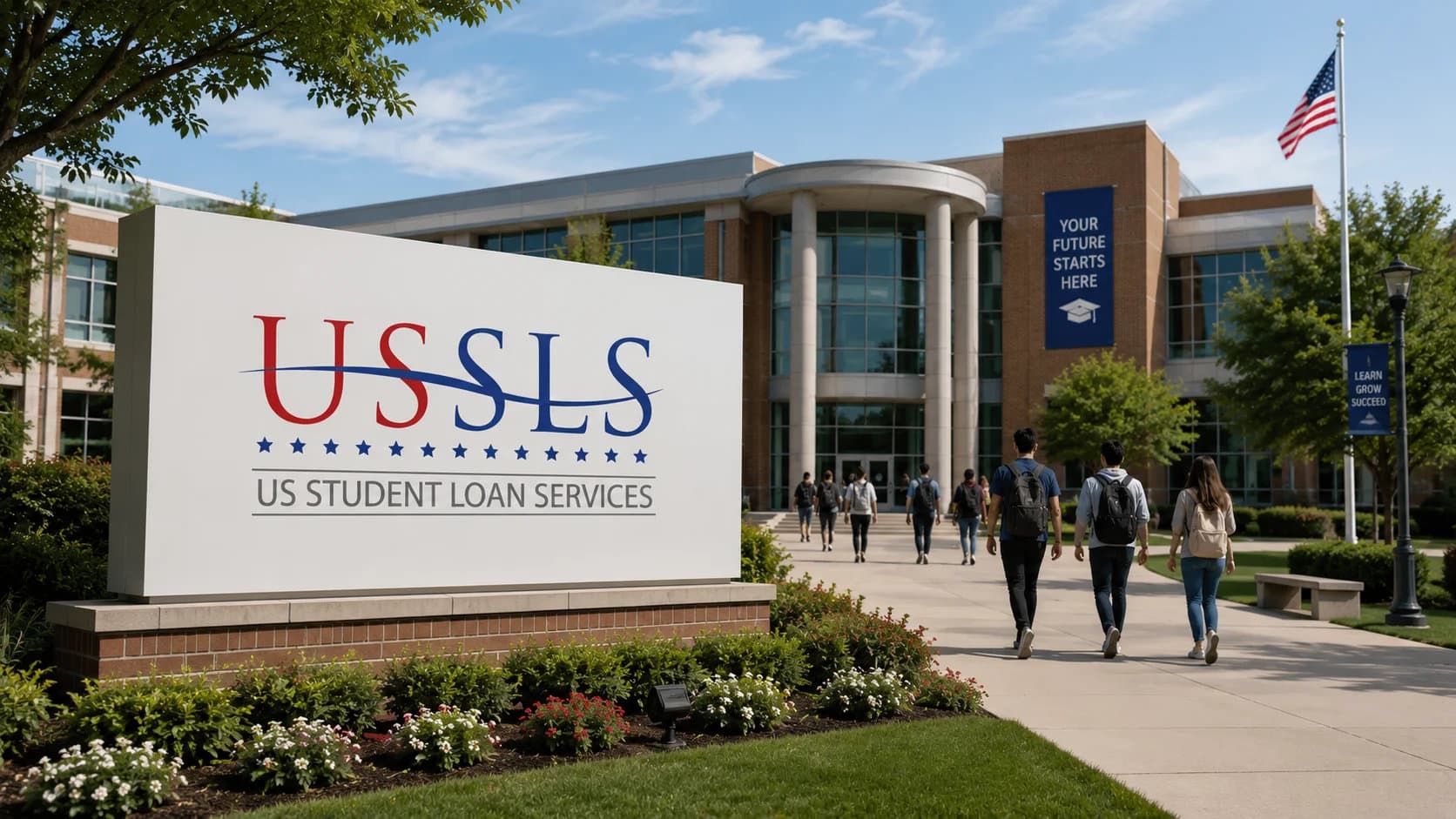
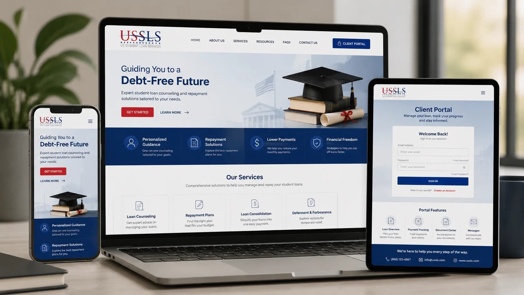
The logo in real life
How the mark holds up on official correspondence, digital platforms, and client-facing materials.
A financial services brief.
A mark that builds trust.
Out of 94 concepts from 22 designers worldwide,
this identity was selected as the winning entry.
More winning 99designs entries

Ready to build something
that works?
I help businesses turn ideas into fast, secure and scalable digital solutions.
Currently accepting 2–3 new projects per month.
Trusted by founders & businesses
to deliver real results.
Quick Response
I reply within 24 hours
100% Confidential
Your ideas are safe with me
No Hiring Hassle
No obligation. Just results.