Housatonic Properties
Real Estate Investment & Property Management
A real estate start-up named after the Housatonic River needed a mark that carried the weight of that name — something modern and quietly luxurious, with a visual nod to the river at its heart. Selected from 143 designs submitted by 38 designers worldwide.
Design a modern, quietly luxurious logo for a real estate investment company — named after the Housatonic River, with a visual reference to the river woven into the mark.
Housatonic Properties is a real estate investment and property management start-up. The company takes its name from the Housatonic River — a detail that wasn't incidental. The client specifically asked for some reference to the river in the logo, making the name itself the central design challenge: how do you translate a river into a mark that feels premium, modern, and at home on a business card, a billboard, and a branded mug?
The brief was open on colour and offered three acceptable logo directions — wordmark, pictorial mark, or lettermark. The style attributes pointed toward the upper half: modern over classic, slightly luxurious, quiet rather than loud, with a hint of sophistication. The final deliverables needed to cover print, online, merchandise, and signage.
Sketches, concepts, and the directions that didn't make it
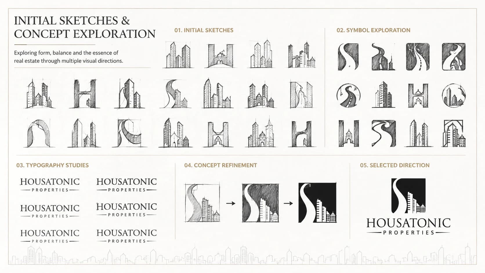
Initial Sketches & Concept Exploration
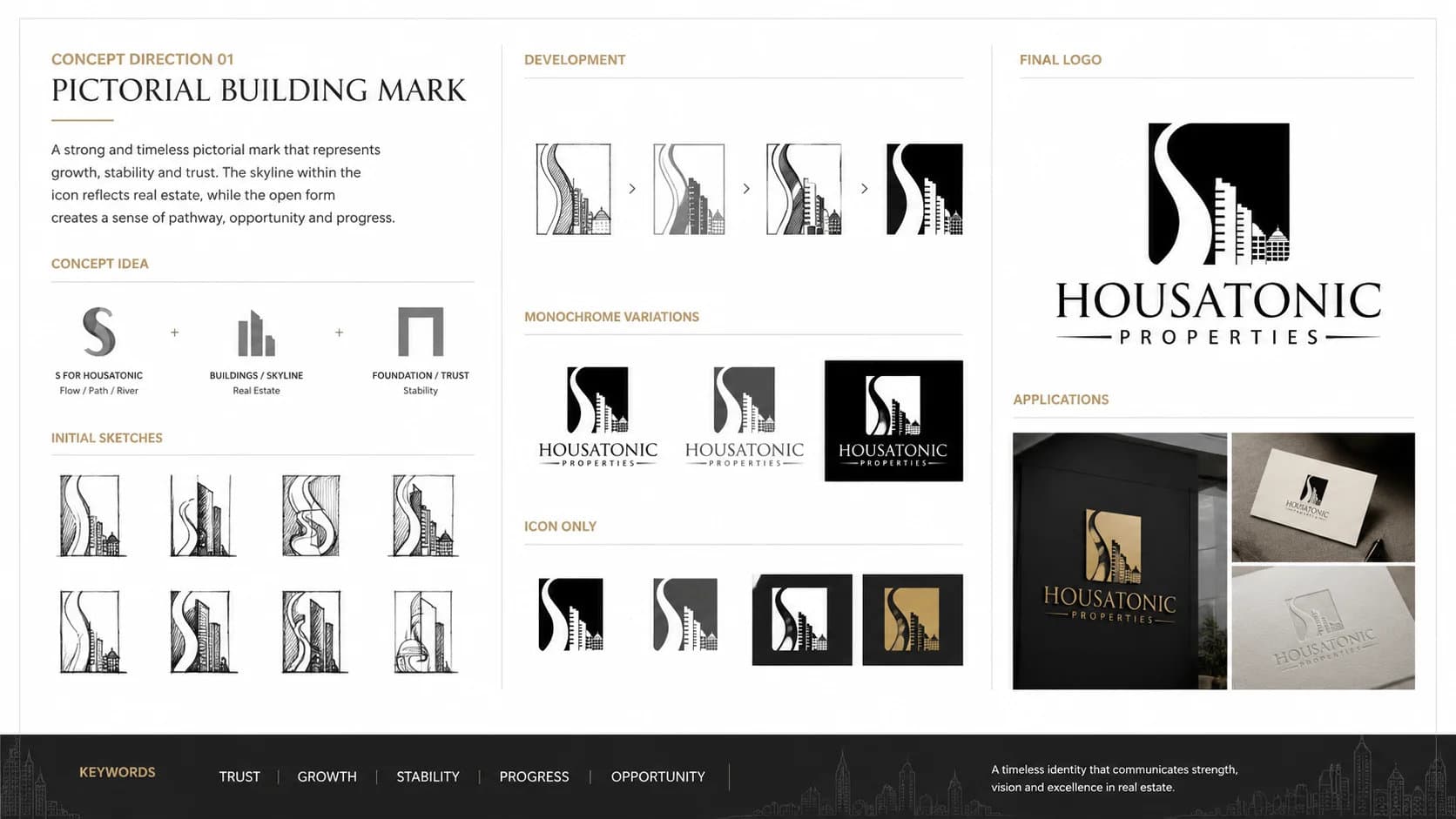
Concept Direction 01 — River Wordmark
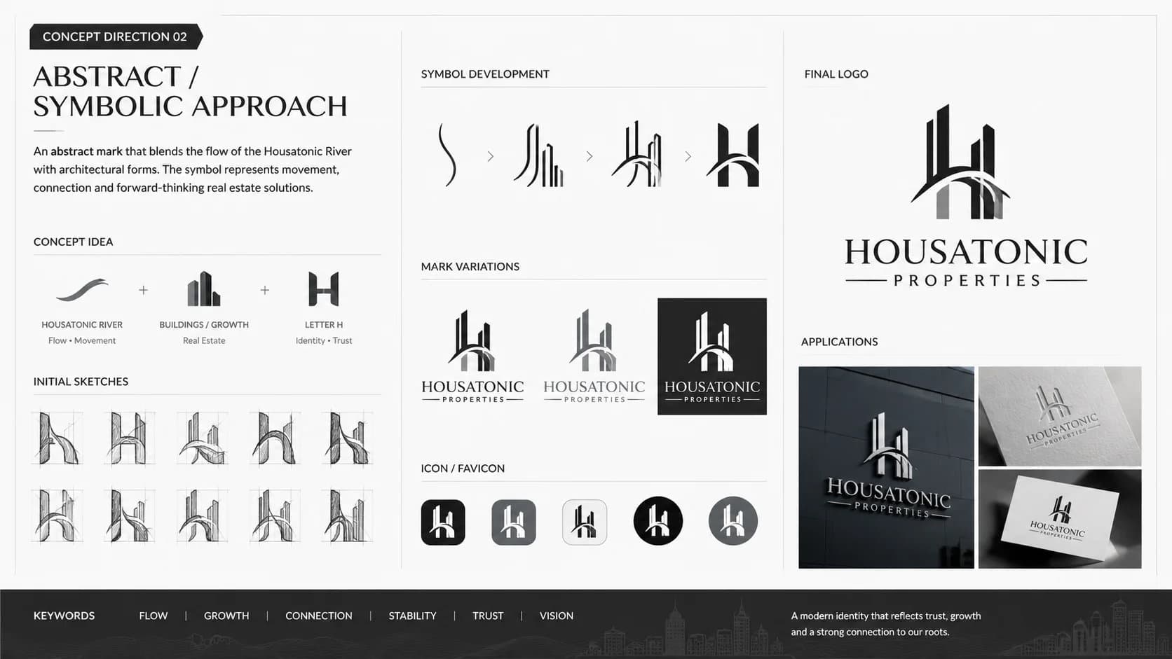
Concept Direction 02 — Lettermark / Pictorial
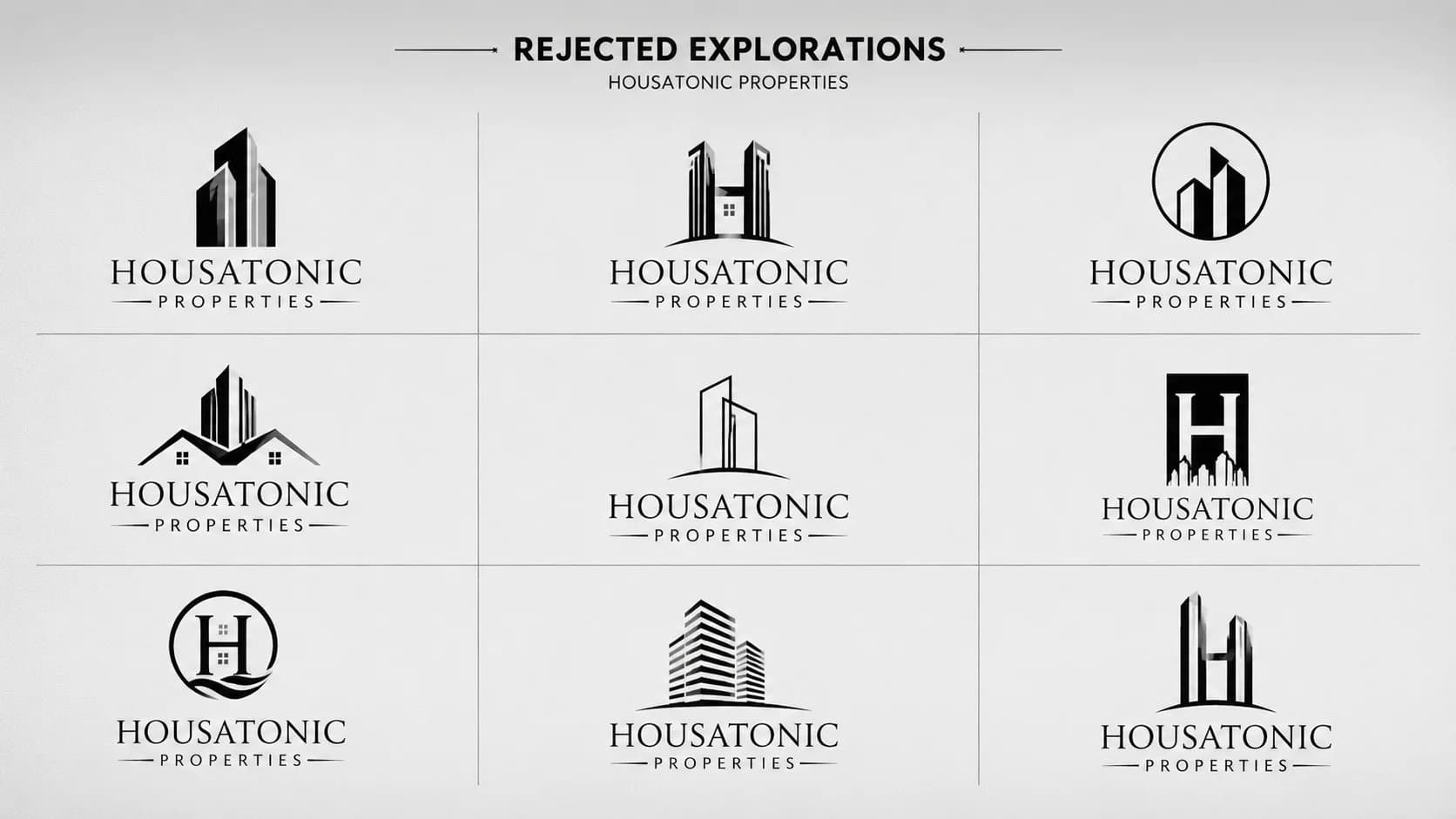
Rejected Explorations
A river-inspired mark built for a premium property brand.
Symbol
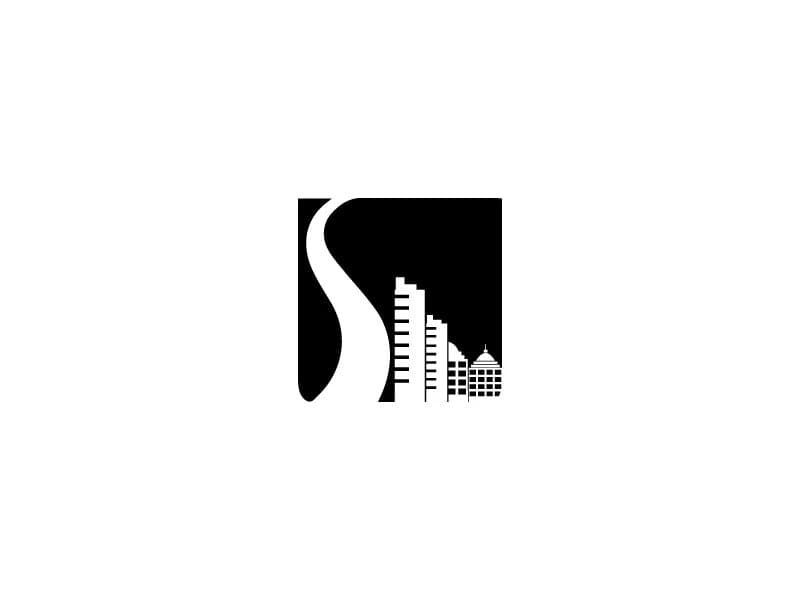
Add symbol description — the river reference requested in the brief is the conceptual anchor of the mark. The form draws from the natural flow of the Housatonic River, interpreted as a clean, modern graphic that reads equally well as a standalone icon and alongside the wordmark.
Typography
Trajan Pro — a typeface rooted in Roman imperial inscriptions. Its classical serifs bring gravitas and permanence to a real estate brand named after a historic river, without ever feeling ornate or over-designed.
Colour
#000000 — pure black. For a premium real estate start-up named after a river, restraint was the right call: black conveys confidence and permanence without the clichés of blue-green property palettes.
Colour, typography & usage
Colour Palette
Black
#000000
Confidence & permanence
Typography
Trajan Pro
Classical serif · Roman inscription origin
Logo Usage
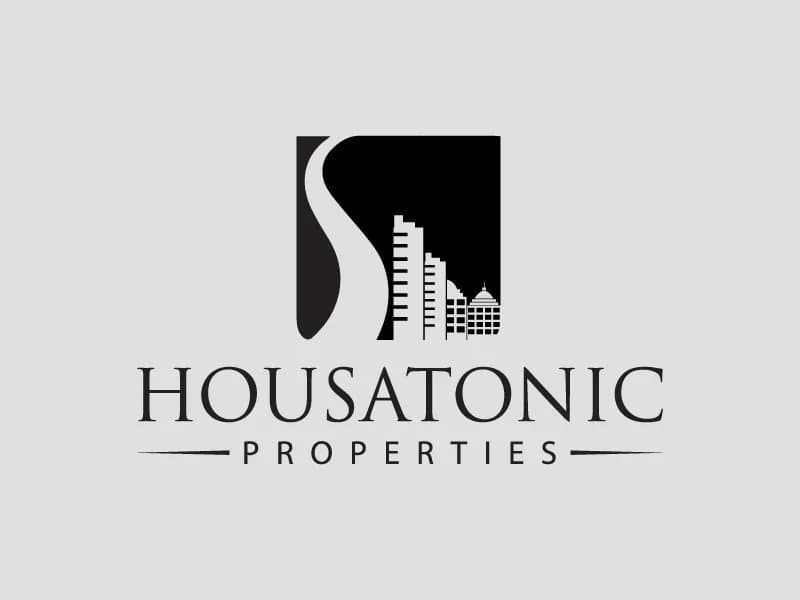
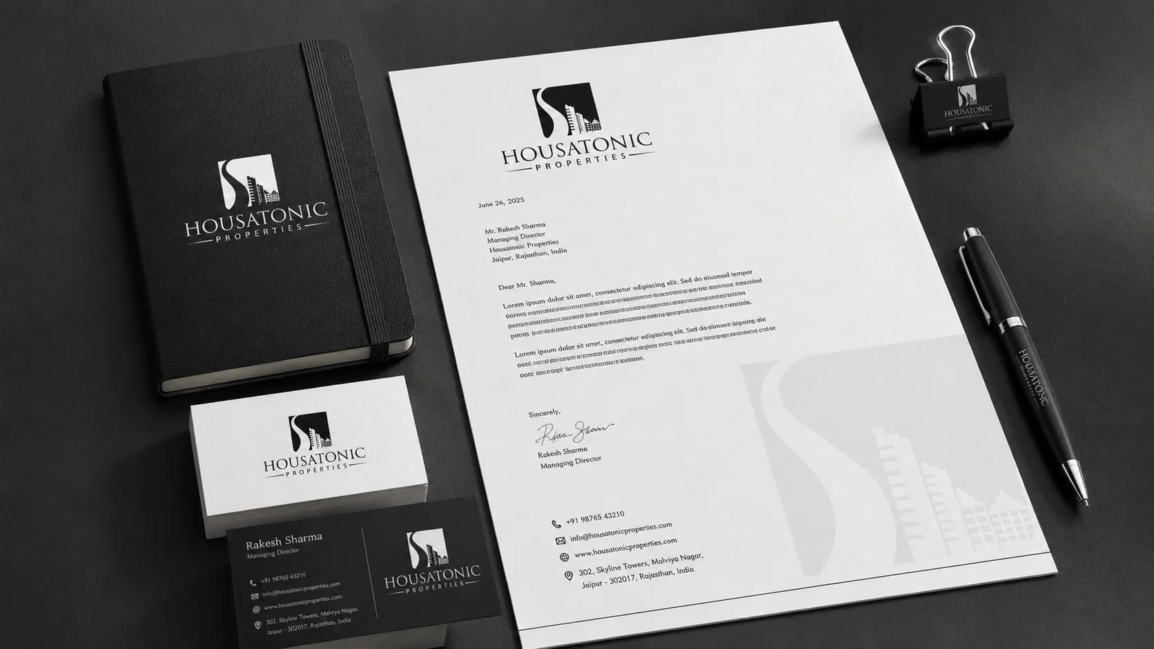
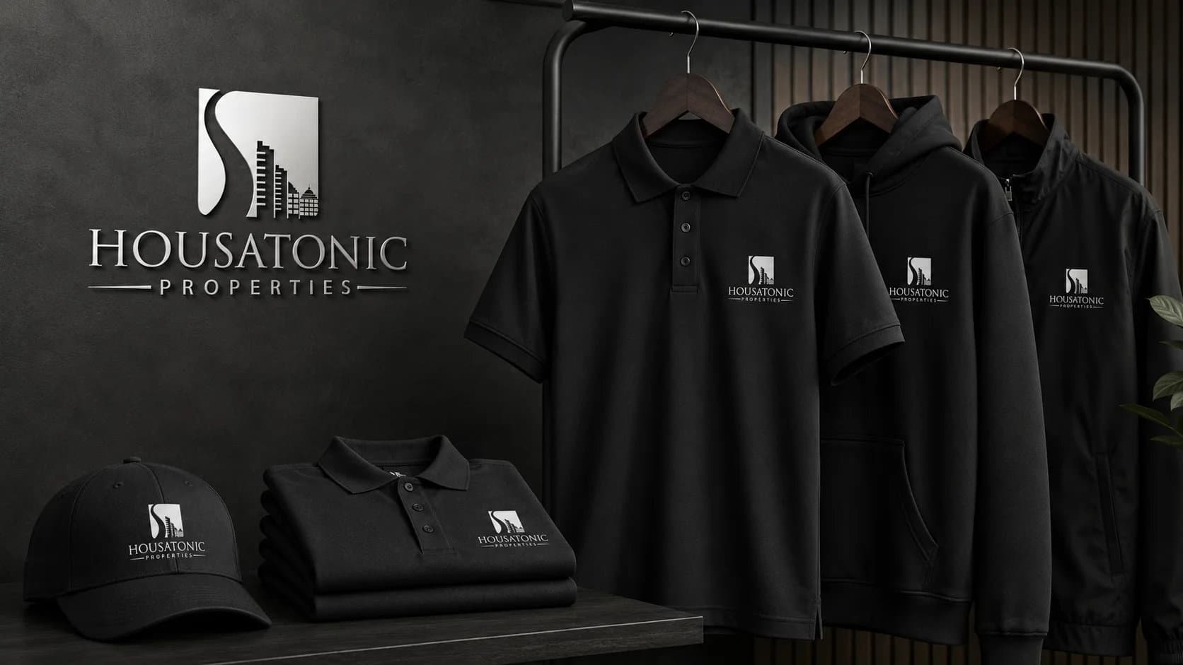
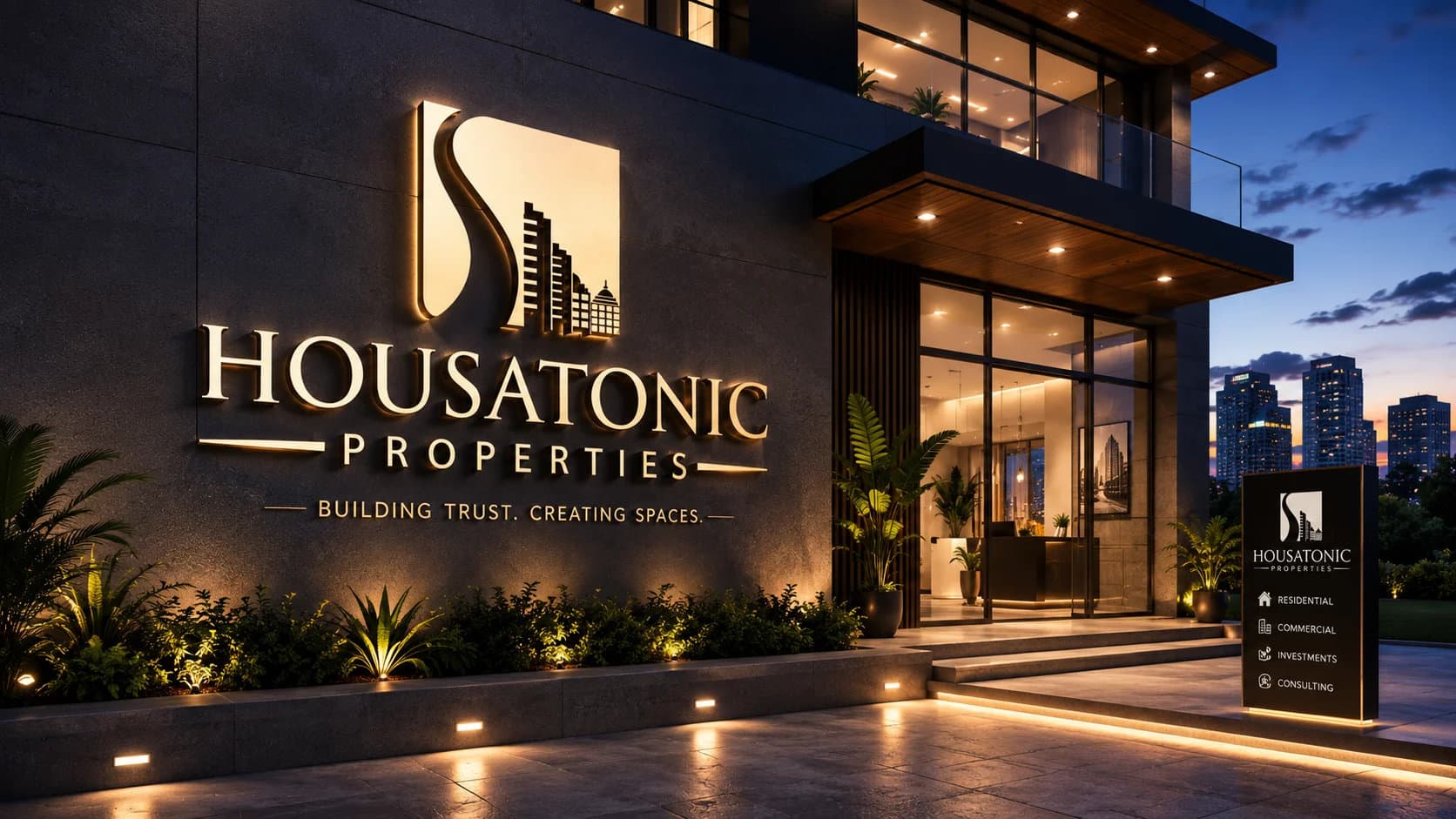
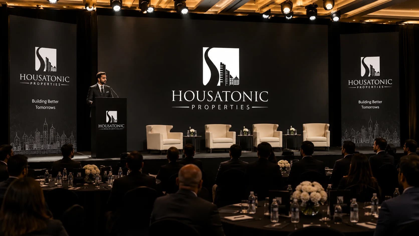
The logo in real life
How the mark holds up on stationery, signage, merchandise, and digital formats.
38 designers.
One winning identity.
Out of 143 concepts submitted by 38 talented designers worldwide,
this identity was selected as the winning entry.
More winning 99designs entries



Ready to build something
that works?
I help businesses turn ideas into fast, secure and scalable digital solutions.
Currently accepting 2–3 new projects per month.
Trusted by founders & businesses
to deliver real results.
Quick Response
I reply within 24 hours
100% Confidential
Your ideas are safe with me
No Hiring Hassle
No obligation. Just results.