Thin Air Adventures
Eco Travel Company Identity
An eco travel company running custom tours through the Tibetan region of the Eastern Himalayas needed a mark as rugged and honest as the Ancient Tea Horse Trail itself — a bold illustrative mountain scene with a lone trekker, rendered in timeless black and white.
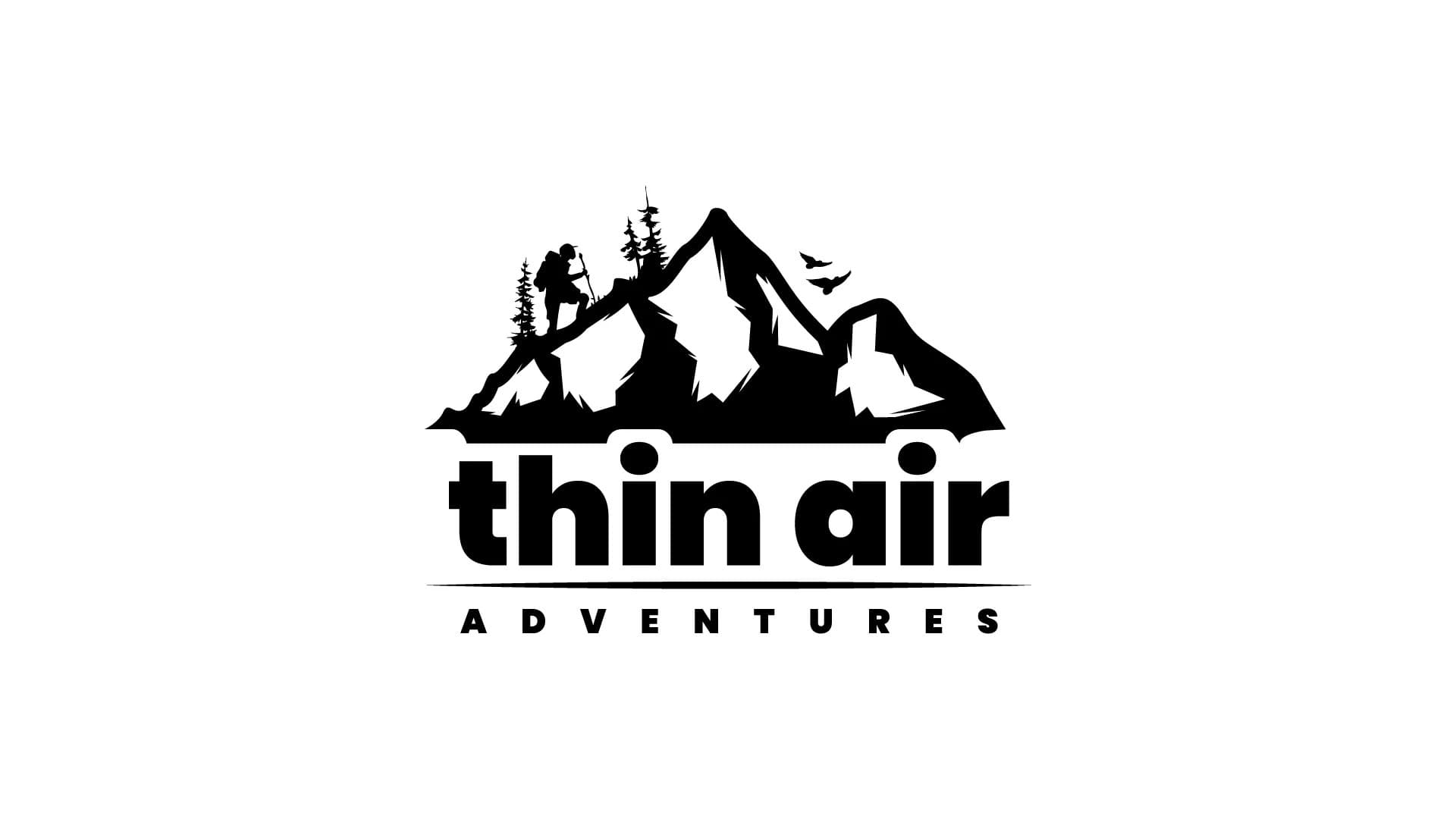
Design a logo for an eco travel company based in Shangri-La, running custom tours through the Eastern Himalayas — something that gives a Tibetan / Mountains vibe.
Thin Air Adventures is an eco travel company headquartered in Shangri-La, Yunnan, China. They run custom tours throughout the Tibetan region in the Eastern Himalayas, with many of their destinations along the Ancient Tea Horse Trail — one of history's oldest trade routes, carved through some of the world's most remote mountain terrain.
The brief called for a logo that felt authentically Himalayan — not a generic mountain icon, but something with real character. The client was open to any colour direction and wanted the design to work across print deliverables (business cards, letterheads, brochures) and online formats (website, advertising, banners). The overriding note: “a logo that gives a Tibetan / Mountains vibe would be splendid.”
Sketches, concepts, and the directions that didn't make it
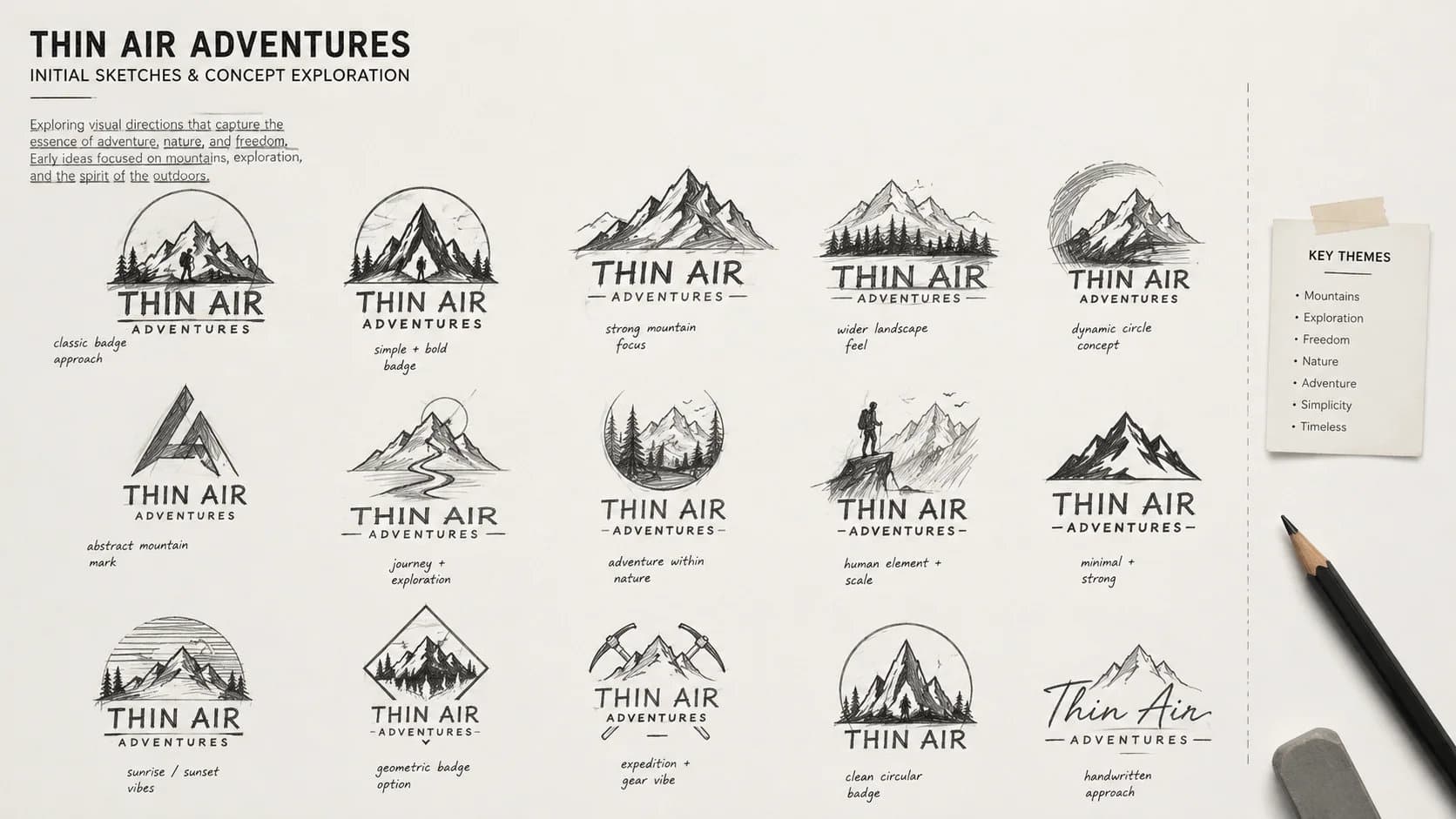
Initial Sketches & Concept Exploration
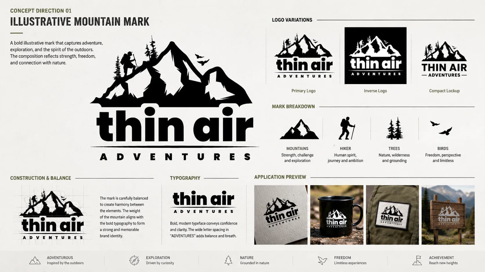
Concept Direction 01 — Illustrative Mountain Mark
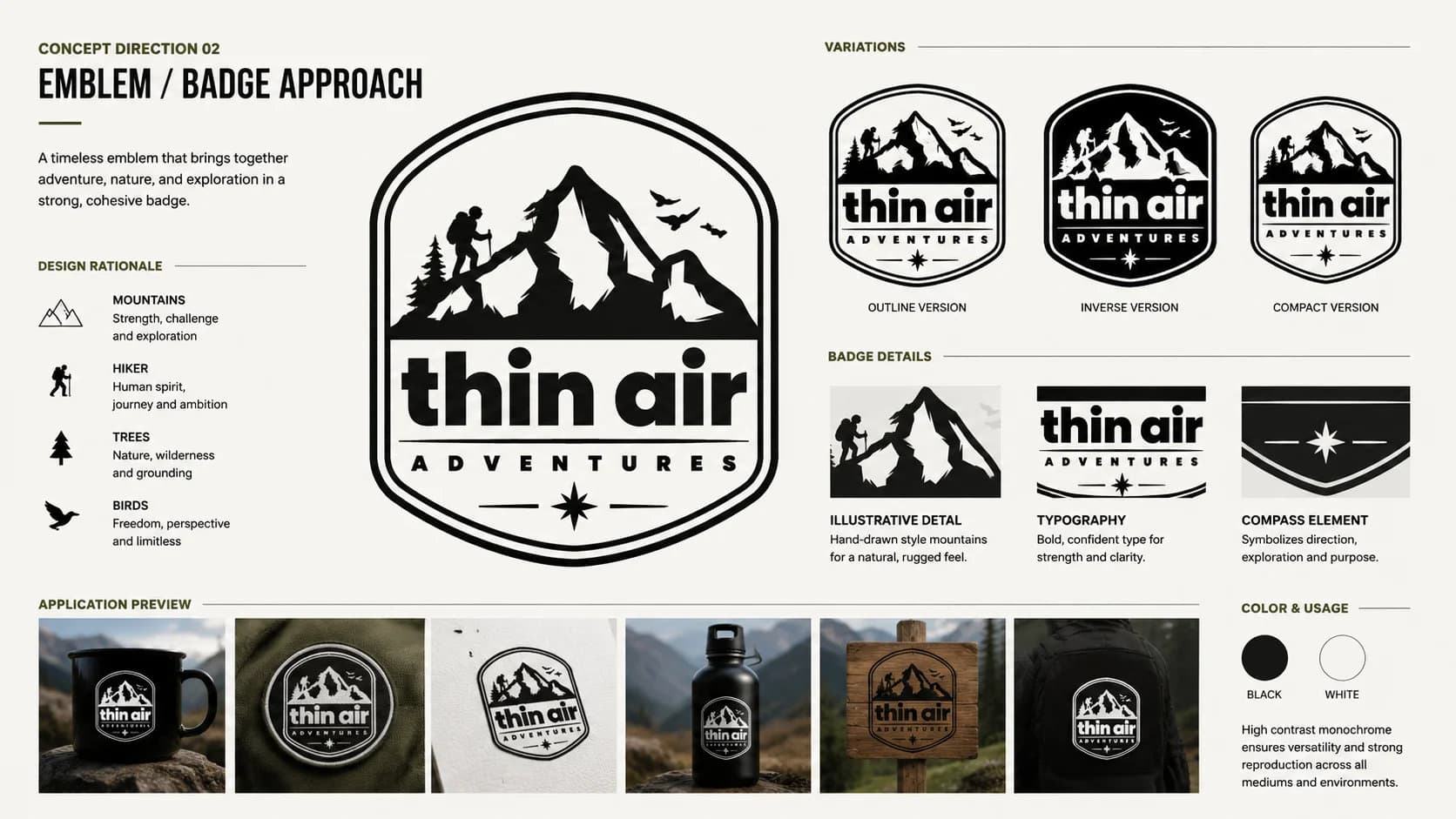
Concept Direction 02 — Emblem / Badge Approach
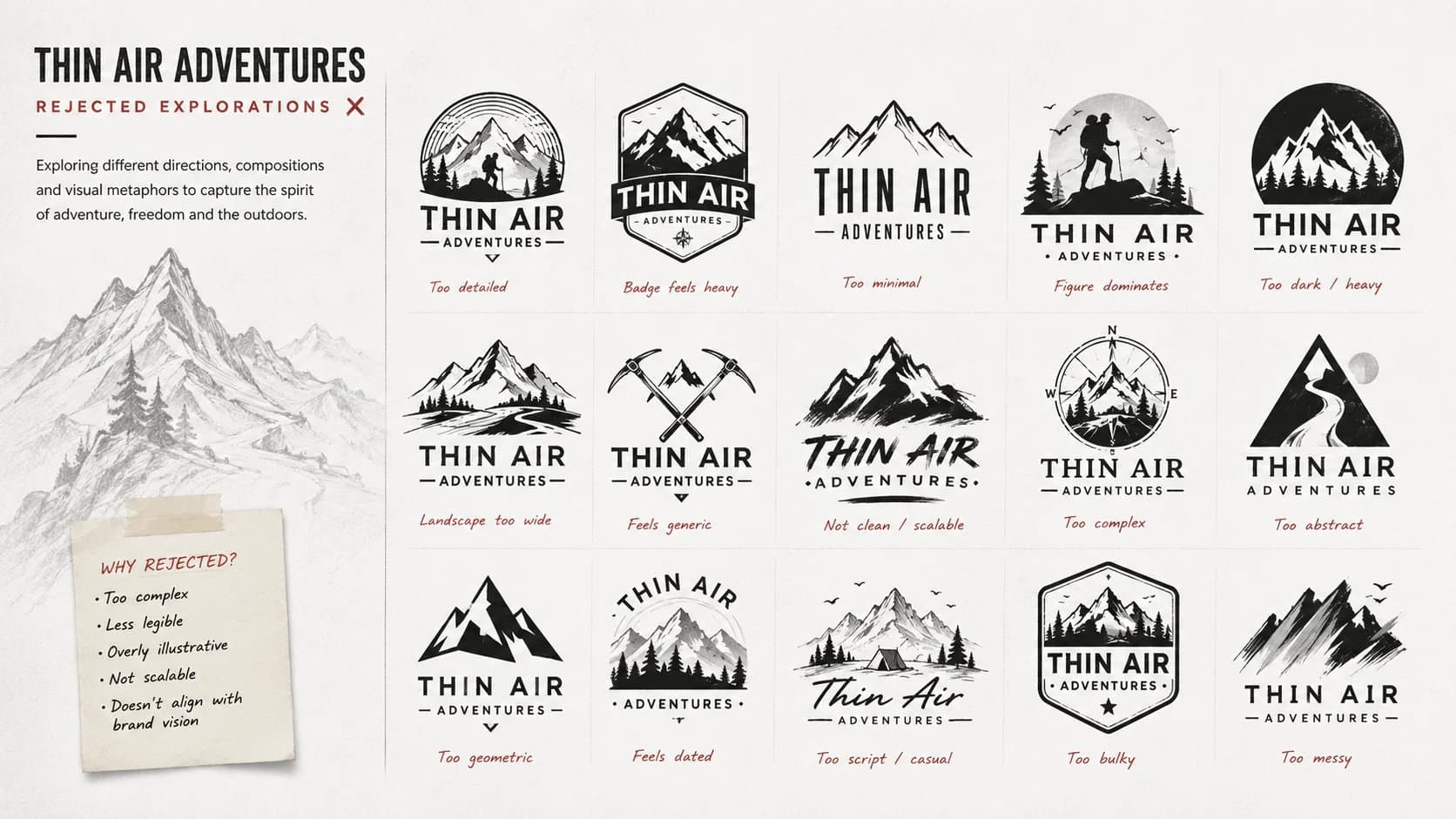
Rejected Explorations
The mountain, the trail, the spirit of the journey.
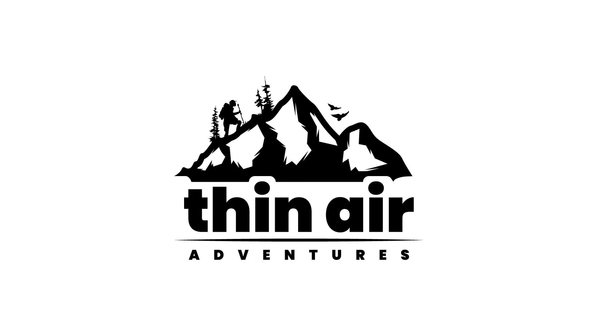
Symbol
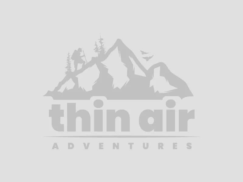
A detailed mountain silhouette anchors the mark — jagged Himalayan peaks, a lone trekker ascending with a walking stick, pine trees, and birds in flight. The scene is dense with narrative but reads instantly at any size, from a business card to a trail banner.
Typography
Add font name — 'thin air' is set in a bold, rounded lowercase that contrasts the ruggedness of the illustration with approachable warmth. 'ADVENTURES' sits below in wide-tracked small caps, grounding the mark with authority.
Colour
Finalised in black and white — a deliberate choice for maximum versatility. The monochrome palette ensures the mark holds equally well on light or dark backgrounds, across print and digital formats, with no colour dependency.
Colour, typography & usage
Colour Palette
Primary Black
#000000
Logo mark & wordmark
Primary White
#FFFFFF
Reversed / light versions
Typography
Primary Typeface
Add font name
Logo Usage
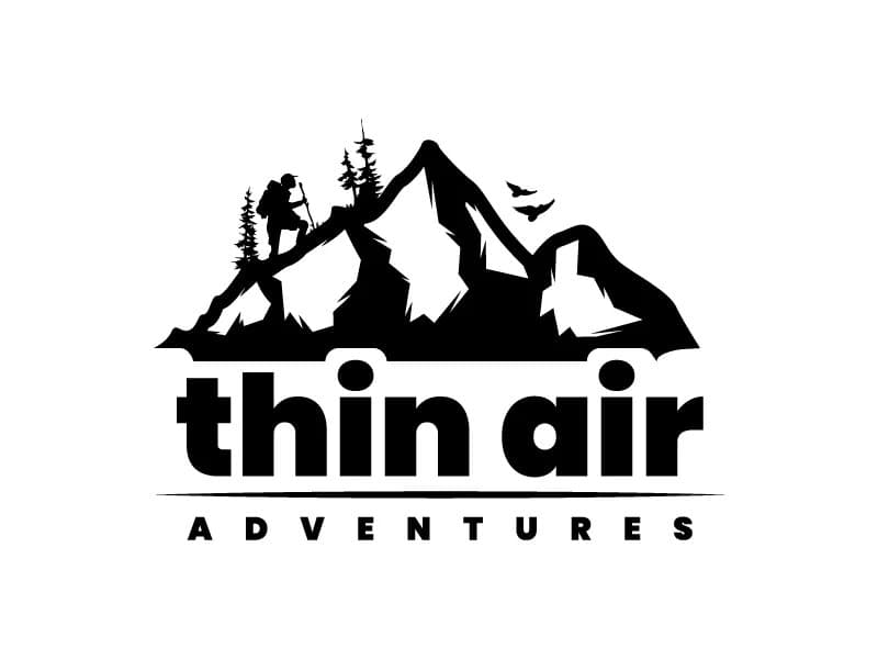
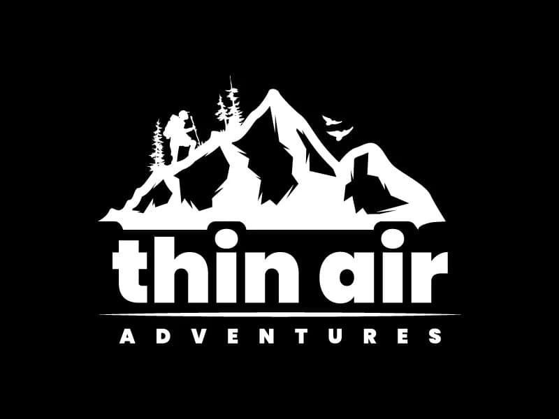

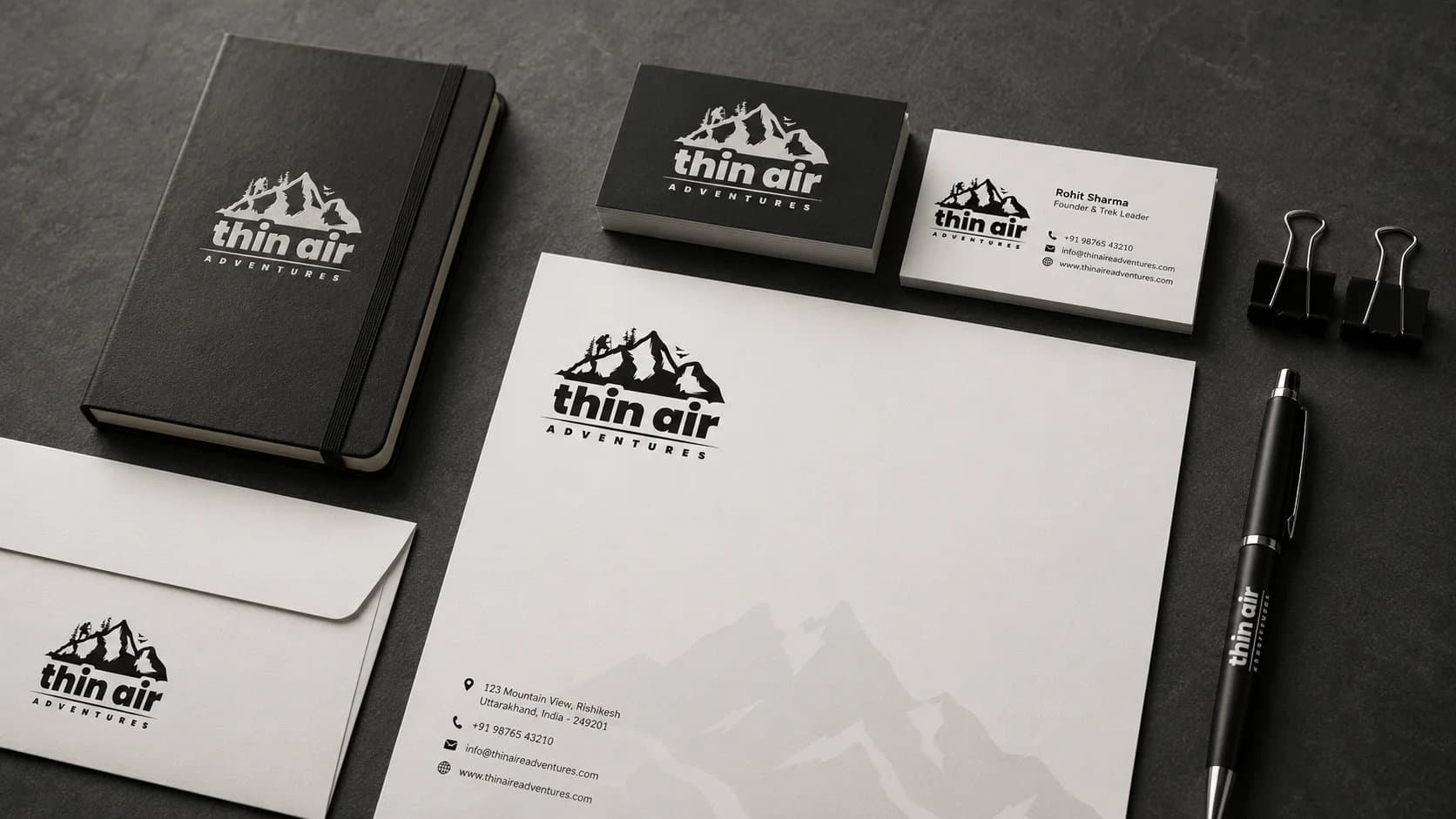
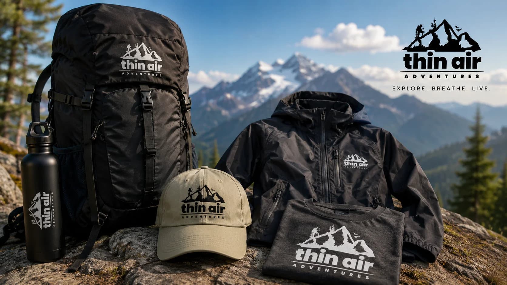
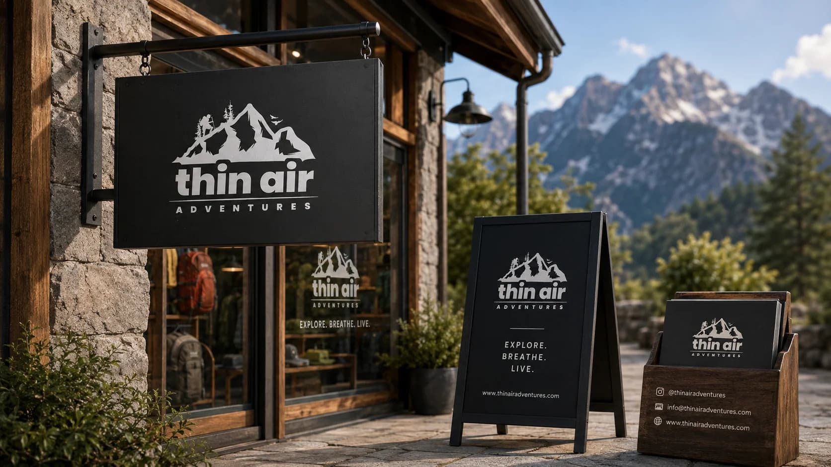
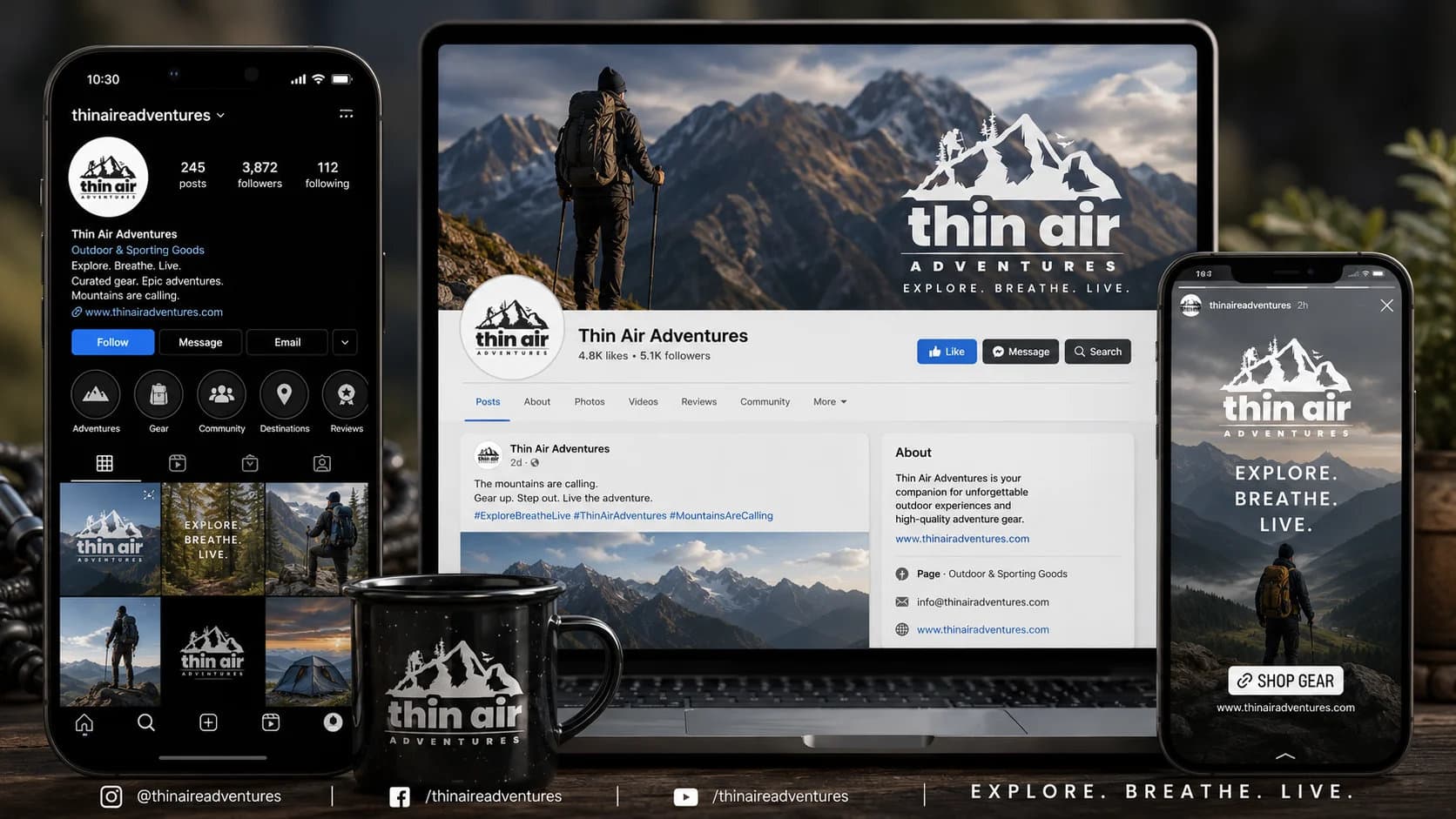
The logo in real life
How the mark holds up on trekking gear, stationery, signage, and digital formats.
A Himalayan brief.
A timeless mark.
Out of 44 concepts from 3 talented designers worldwide,
this identity was selected as the winning entry.
More winning 99designs entries
Ready to build something
that works?
I help businesses turn ideas into fast, secure and scalable digital solutions.
Currently accepting 2–3 new projects per month.
Trusted by founders & businesses
to deliver real results.
Quick Response
I reply within 24 hours
100% Confidential
Your ideas are safe with me
No Hiring Hassle
No obligation. Just results.